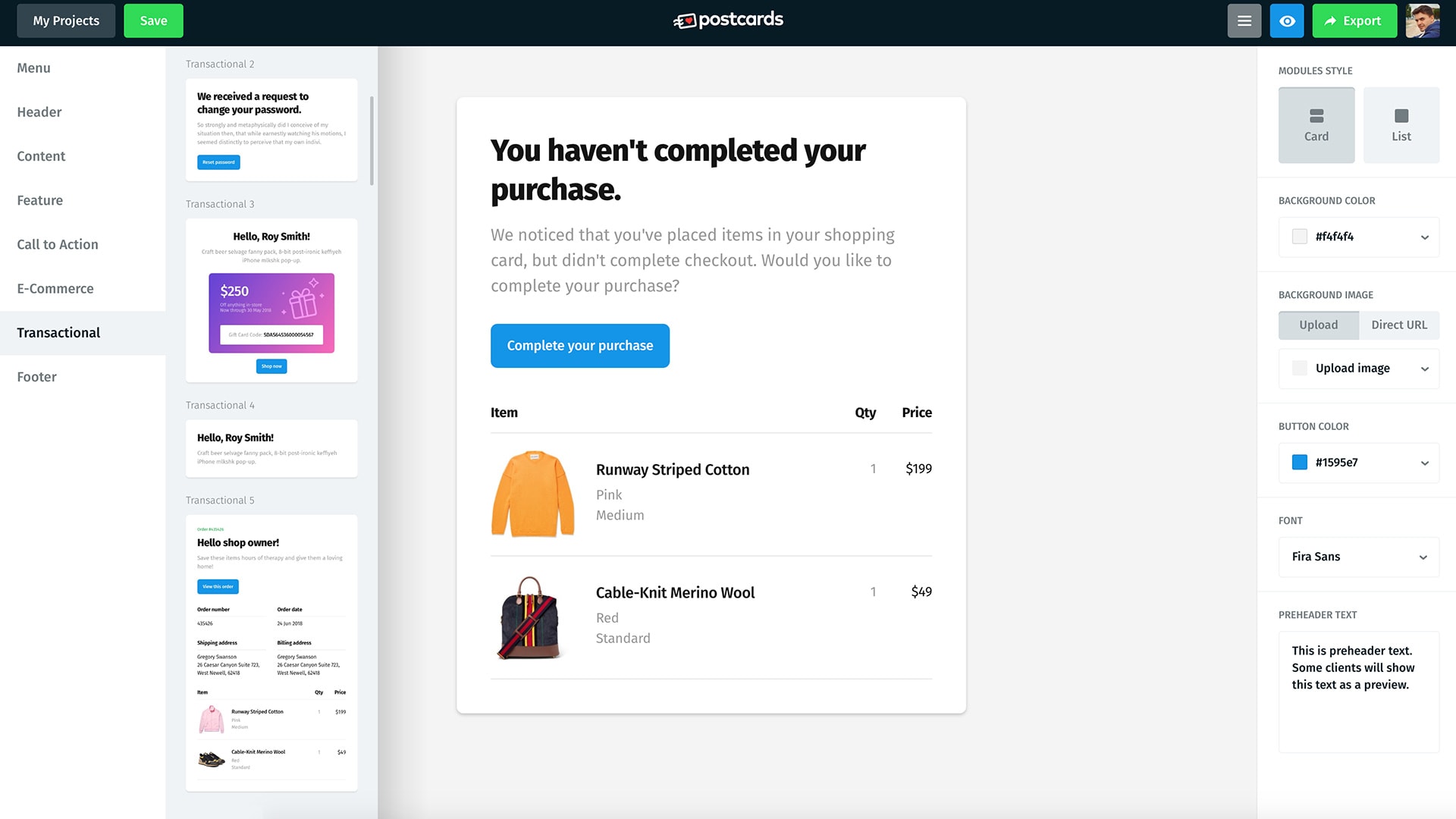
There are two general types of email newsletters: promotional and transactional.
While the first is widely used by email marketers to draw attention to websites and goods, the second is considered to be a technical asset. While the first is a constant topic for discussions, the second maintains a low profile.
The truth is that despite the fact that website owners put their heart and soul into every promo, spend lots of money, do constant A/B tests, analyze stats and improve the performance of newsletters, still transactional emails get at least double the click-through rate. It’s somewhat ironic that the kind of email that some people do not bother to create by itself — entrusting this mission to a third party — has more potential to make your message heard.
With the majority of transactional emails, you can be sure that subscribers open and scan from top to bottom. What’s more, some transactional emails are even saved, bookmarked and re-opened several times.
Why is this? People expect transactional emails in their inboxes. These newsletters come as no surprise. Some people even become irritated and nervous when they do not receive them in time. In most cases, transactional emails give subscribers exactly what they need. As a rule, transactional emails remain wasted opportunities. So let’s change that trend and find out how to create good transactional emails and enjoy the benefits.
Types of Transactional Email Newsletters
So what are exactly transactional emails? They are technical assets that go to a subscribers’ inbox.
- Welcome email
- Notification email
- Confirmation email
- Reminder email
- Onboarding email
- Activity email
- Authentication email
- Abandon shopping cart email
- Cancellation email
- Confirmation email
- Subscription email
- Verification email
- Payment email
- Order email
- GDPR email
- Expiration email, etc.
Each is self-explanatory, and each includes more information than you expect.
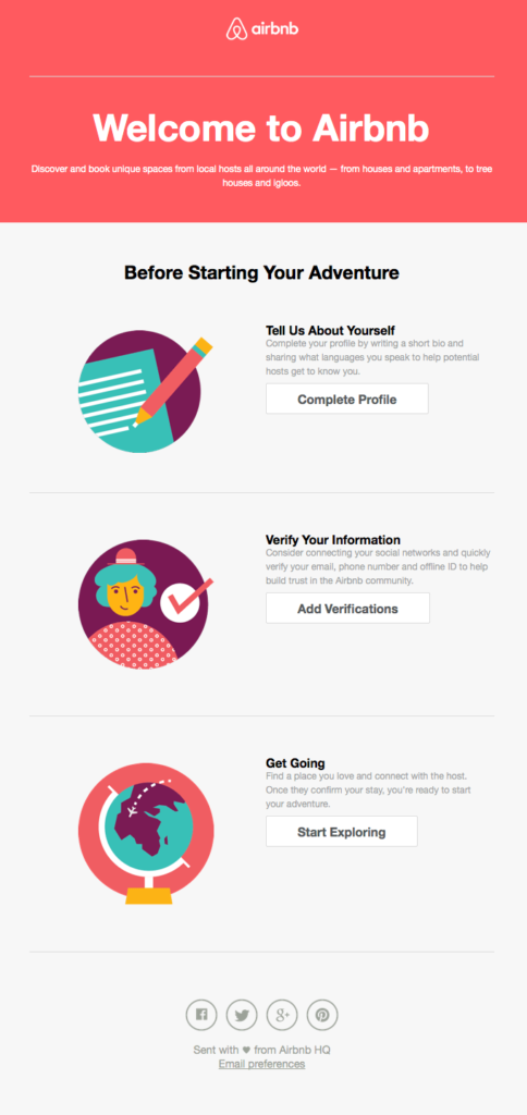
Online HTML Email Template Builder
With Postcards you can create and edit email templates online without any coding skills! Includes more than 100 components to help you create custom emails templates faster than ever before. Try now for free!
Transactional emails provide a piece of specific information to a particular group of people. They are often automatically generated, but it does not mean that you can’t interfere with them. No one stops you from changing the design of the newsletter or adding extra content.
Moreover, it is even recommended to customize this kind of email newsletter since they should be a part of the overall experience and support the brand on all fronts.
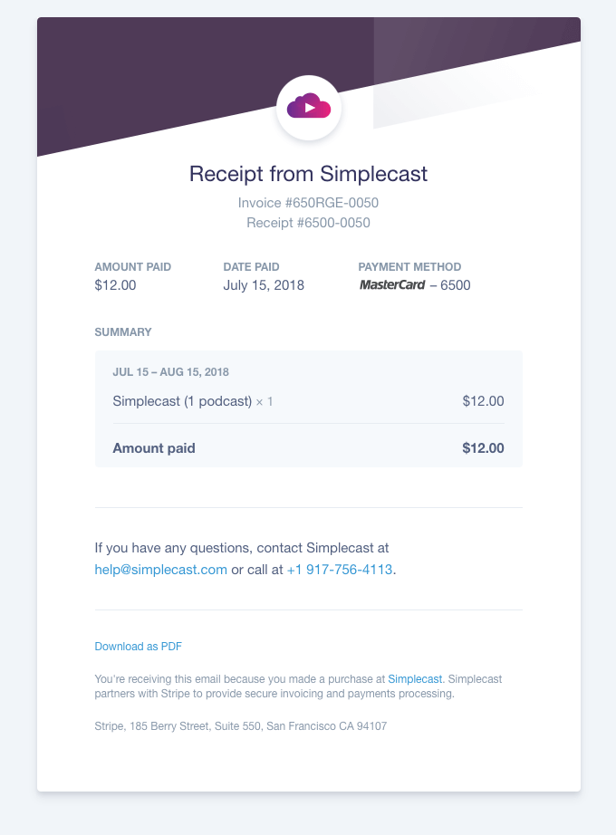
Email Design
Design plays a crucial role in delivering your message to the audience. Whatever transactional email newsletter you are going to create needs to make your message presentable. All vital information should be instantly available and quickly discernible.
Here are some essential tips:
- Create a well-structured message. Use lists, headlines and paragraphs, especially when you create plain text versions. Proper formatting is the key to success.
- Divide the layout into several horizontal sections to efficiently accommodate all the data. If you use Postcards, then it is easy to do since the online builder lets you create the newsletter block by block where sections are skillfully delineated, and information is carefully dished up.
- Make calls to action prominent. Bright buttons with a relatively large size placed in the left, lower part of the page can do the trick. However, if you create plain text email with an unformatted design, use a simple blue link which users are accustomed to seeing. Avoid inconsistencies.
- Use graphics to assist in delivering the message. This is extremely important for emails that include onboarding. Remember, you can benefit from animated GIFs that support the message as well as add some playfulness to the experience.
- Include branding. This is an absolute must-have. Even though people expect transactional emails, it does not mean that you are the only one. It is crucial to build a consistent experience from A to Z. And that means that all your email newsletters should align with brand identity.
- Mobile layout. There is no need to highlight the importance of mobile-friendliness. Your email newsletter should look great across devices. This should be your first concern; if you use Postcards, you do not need to worry about that since all the templates work correctly in any screen dimension.
- Handle email agents’ inconsistency wisely. If you are going to use images or a specific CSS solution, make sure they work properly in popular email clients. It means that you need to familiarize yourself with support. If you do not want to mess with it, use an online email newsletter builder like Postcards that will do the heavy lifting for you. They offer design solutions that work consistently in every email client.
If you need visual guidance on how to create a good design for your transactional email, here is a good video tutorial. It shows how to create an email newsletter in under five minutes.
Create and Customize an Email Newsletter Template in Postcards
Email Content
It is here where you can turn a simple shopping cart abandonment notification into a life-saver by adding a coupon with a discount or special offer. Content is still king when it comes to transactional emails. Here’s how to make the most of it:
- Make meta information, particularly the subject, informative. Avoid clichés and try to make it unique and as personal as possible.
- Avoid phrases such as no-reply, info, alert. They are boring.
- Personalization is a top priority. Use real names; people love it. If you provide support or feedback, add a link to instant chat or email. Also, an actual photo of the member of the service team that is going to handle issues is a bonus.
- Avoid date and time since they can be irrelevant. However, if the message is time-sensitive then include the exact day. For example, use “Your subscription will be canceled on January 12, 2019” instead of “Your subscription will be canceled in 3 days.”
- Include info that customers are waiting for.
- For a registration email, give user all the credentials they need.
- For a welcome email, provide helpful links.
- For a GDPR notice, include an unsubscribe button.
- Use deep links. There is no better practice than to provide users with quick ways to get to their destination. Avoid links to homepage or login page.
- Use a sense of urgency wisely. People need time to make decisions and pushy behavior can scare them away.
- Include your contact information. It may seem a bit formal but your email newsletter should present your company no matter what.
- Notification management. An unsubscribe link and link to managing notifications are must-haves. Every email newsletter from your company should have this information. Respect the rights of your subscribers.
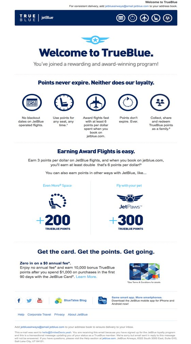
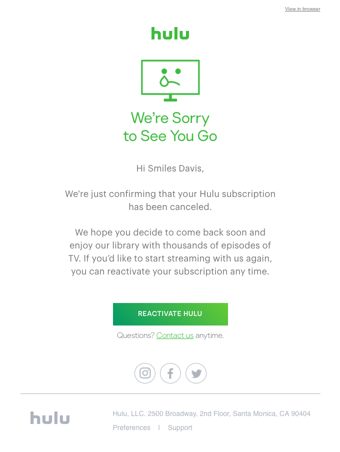
Hulu subscription has been canceled
Here’s some more general advice for specific types of transactional emails.
- For welcome emails, use as much information as possible. Provide links, explain why you are the best, make the onboarding process clear by using visual cues, etc. Show advantages of your company supported by backlinks to corresponding landing pages.
- With the most popular «Reset password» email, get straight to business by providing the exact link as well as adding login credentials. Here you can include special offers or fresh news as an added bonus.
- For new comment notifications, use all the personal information that is available plus an avatar. You can also add links to hot discussions.
- For shopping cart abandonment emails, show goods, total amount, taxes, shipping details, etc. It is a perfect place to add a special offer or discount as well as promote your referral program.
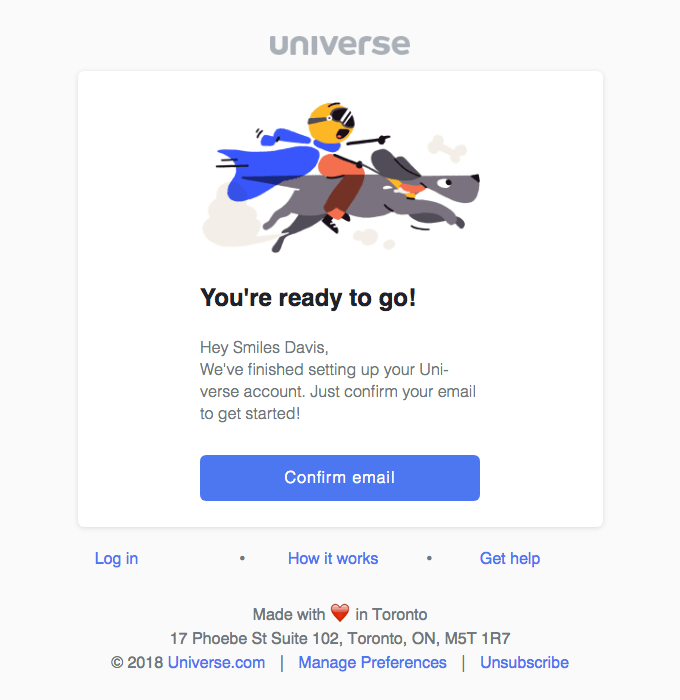
Please confirm your account by Universe
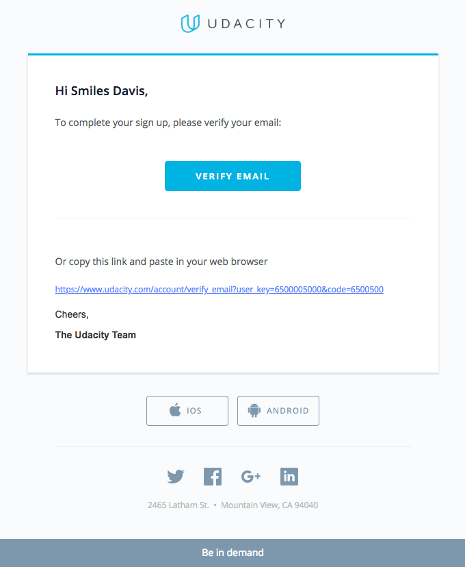
One More Thing
Before making improvements in transactional emails consider these tips:
- Turn transactional email into a two-sided conversation. Be ready to accept replies.
- Do not get carried away with images. Promotional email newsletters are where you can experiment with images, but not transactional ones. One or two colorful pictures are enough.
- Re-visit emails once in a while since information should always be relevant especially when you add offers.
- Align with your brand identity. If your brand identity undergoes changes, do not forget to introduce the same changes to transactional emails.
- Mind the language of the email copy. Make the copy soothing and pleasant.
- Do not overdo. Not all transactional emails are for foisting goods, offering discounts or engaging customers.
- Try to balance between plain text and rich media versions.
- Test, test, test.
Tip: Using Postcards, you can create beautiful transactional emails in minutes.
Conclusion
Transactional emails are the cogs that keep your platform running efficiently. They are essential to every online service, whether you run a blog or an e-store. There are so many ways to reach out to subscribers, and transactional emails provide a great opportunity. Use this to your advantage over promotional emails to improve your marketing campaigns.
Like what you’re reading? Subscribe to our top stories.


