It seems obvious that one-page websites would be much easier to build than multi-page ones. In truth, it can often be much harder to make a one-pager user-friendly and at the same time visually appealing.
It’s not usual for a single pager to take 10 times longer to design than to design several pages for a multi-page site. The challenge is that it takes a whole lot of planning to stuff everything you want to say on a single page.
You can make a page as long as you want of course, but most visitors will start calling it quits after the third scroll.
This guide for building a single pager is centered around 5 critical elements. Not exactly like the 5 foundational elements of nature: fire, earth, water, air, and spirit. But suggestively close.
And, you want to get them right.
5 Critical Elements that Can Make or Break Your Design
#1 The GOAL: Identify the Goal of the Website & Work Towards It
There’s no sense starting your design until you understand what your website aims to achieve. Based on that objective, you will be able to plan its structure.
A one-page website needs to drive the user journey toward a single goal; which could be:
- to sell something,
- to present a portfolio,
- to announce an event;
You should look for features that might cause visitors to make a quick exit. This can happen even before they respond to a call to action.
Online HTML Email Template Builder
With Postcards you can create and edit email templates online without any coding skills! Includes more than 100 components to help you create custom emails templates faster than ever before. Try now for free!
Like page loading speed for example.
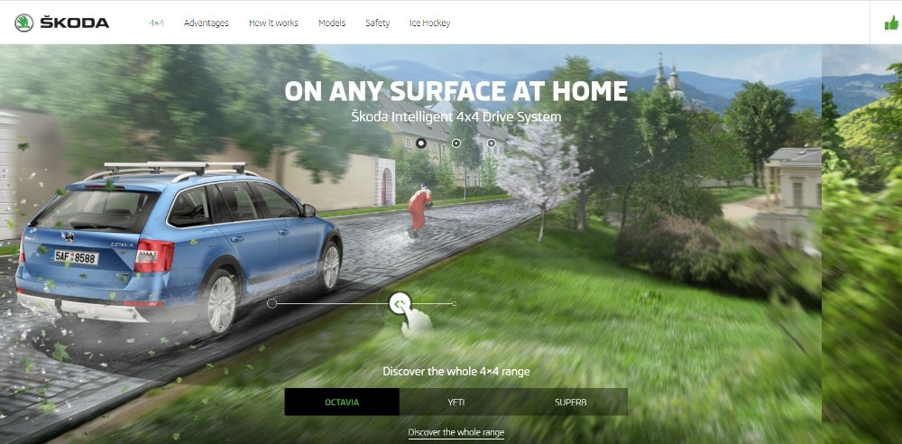
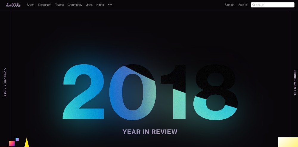
This website’s interactive effects above the fold don’t drag down its load speed.
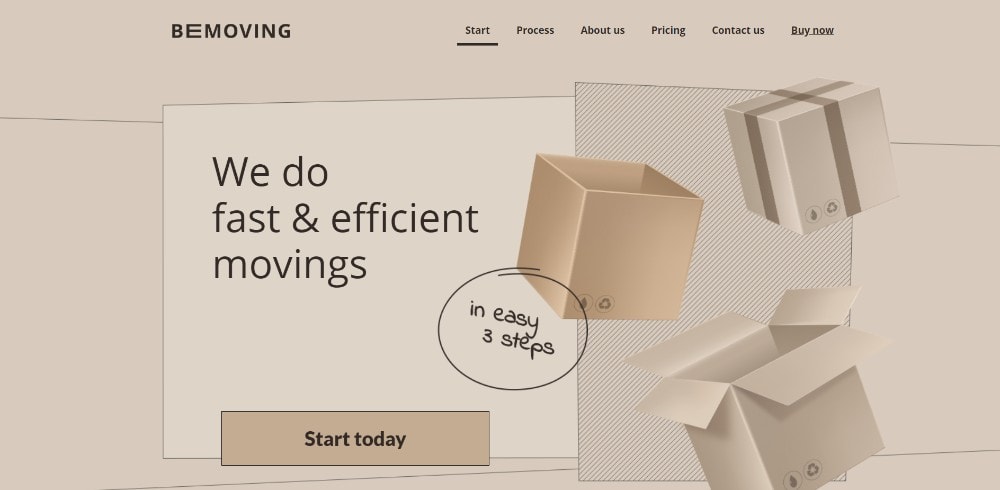
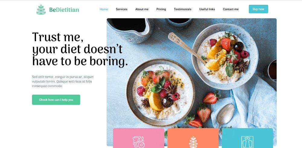
This BeTheme pre-built one-pager features a static image that appears to be dynamic.
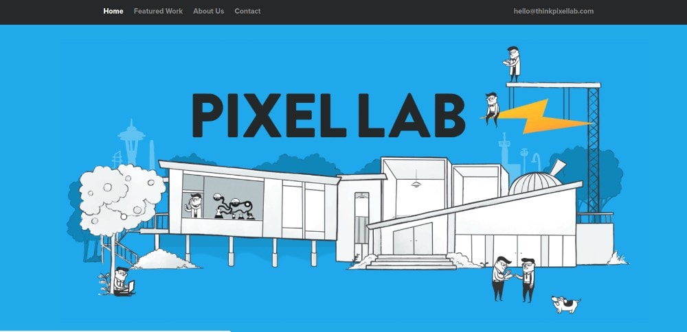
Tiny animated items liven up this page’s illustration without slowing anything down.
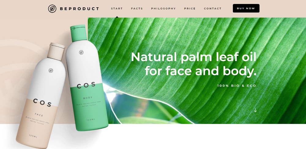
Here’s an example of where a page’s fresh look is in itself a selling point.
This page provides an excellent example of the role large images and sliding panels play in engaging users.
You don’t need a lengthy technical discourse to promote an app. Vivid colors, neat effect, and a genuinely cool presentation will do the trick.
#2 TEXT: Keep It to the Minimum & Make It Easy to Read
Fill a one-page website with text above the fold and few users will bother to scroll down the page. Instead, you need to keep the amount of text to a bare minimum by focusing on bold headlines. You can have short paragraphs, and bullet lists.
Avoid blocks of text – anywhere on the page. Separate text into sections and integrate them into visuals. You can do anything else that makes it entertaining and easy to comprehend.
One-page websites you’d consider bookmarking might include:
It’s so entertaining you’ll want to go through every section – maybe twice.
An example of neat organization.
The core information is kept above the fold, with bullet lists helping to keep the message as concise as possible.
Another example of where large attractive images help do the selling. Here, they are accompanied by appropriately placed paragraphs of text.
When a vehicle has the stature this brand does, focusing more on high quality images and less on text is more than sufficient.
#3 VISUALS: Identify the Right Patterns & Use Negative Space Wisely
People tend to read a text in an F pattern and look at visuals in a Z pattern. Thus, it’s necessary to place text and imagery correctly so as to maintain a flow.
This is an area where a generous use of white space is helpful to separate sections. You can make the text easy to read and keep people engaged. Just don’t overdo it.
An example of how white space can be used to provide a sense of order.
This website is wildly creative. White space is its canvas.
The white space in this pre-built one-page website maintains a sense of order. It also makes the different sections appear to pop out.
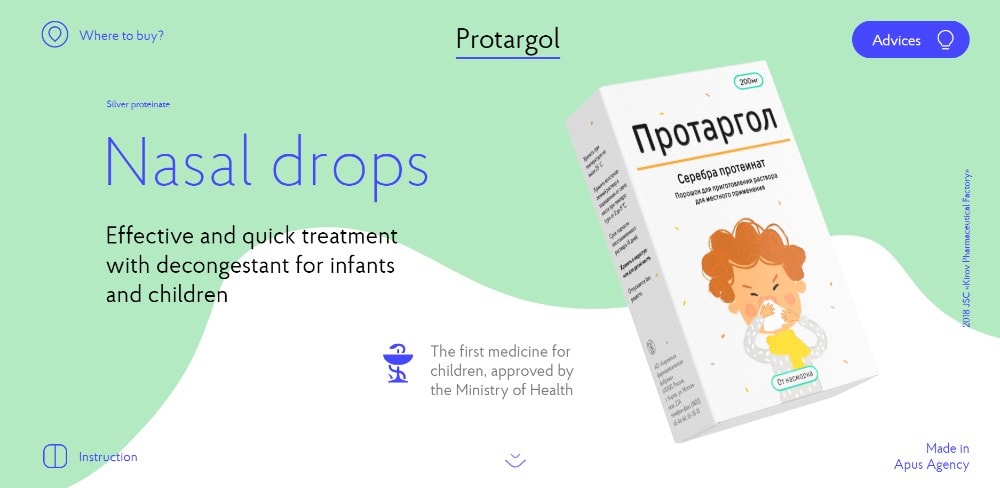
Here’s an example of how you can use several different design principles to the max to create an amazing visual splash.
Pages promoting nasal drops can’t be expected to excite. This one breaks the mold, thanks to an ingenious use of slides, white space, and animations.
#4 NAVIGATION: Make It Easy to Navigate & Entertaining to Scroll
Few things irritate visitors more than navigation and scrolling issues. You have to be careful with long-form one-pagers. You need to design your website’s navigation in a way that will keep visitors wanting to discover more.
Using either a horizontal stick menu or a sidebar menu is a good approach. It makes it easier for people to jump to sections or areas of interest with a single click. This is opposed to the sometimes tiring analog approach – mouse scrolling.
Auto-scrolling navigation links work well too. A visitor can enjoy watching a page scroll “on command” instead of jumping from section to section.
These one-pagers are notable for their use of engaging, user-friendly navigation:
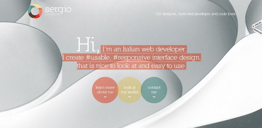
This designer’s website employs 3 different auto-scrolling links.
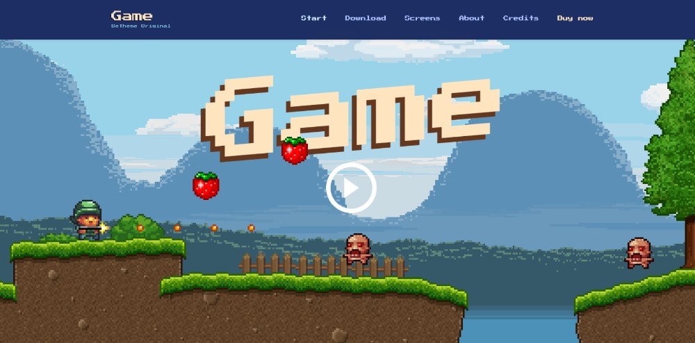
Be Game offers a navigation experience you might find highly entertaining.
Three things stand out, the color scheme, the layout structure, and how you can scan the page with 3 mouse scrolls.
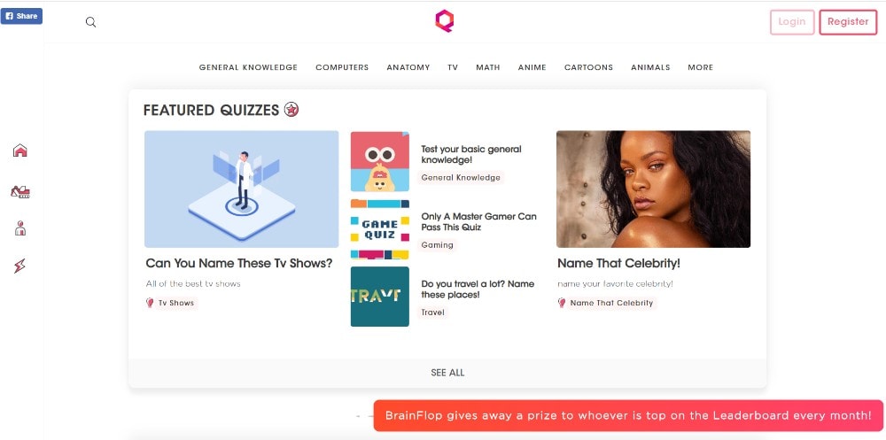
These folks really want to help you navigate their site quickly by providing a menu on the top and one on the left.
#5 CALL TO ACTION: Identify the Correct CTA & Don’t Be Afraid to Use It
A CTA button typically leads to a website’s goal, so don’t be afraid to use one to induce people to take action. That’s the beauty of a one-page website. It typically directs people toward a single goal.
You’ll usually want the CTA button above the fold, e.g. if you’re presenting a portfolio. But for services or products, you might need several.
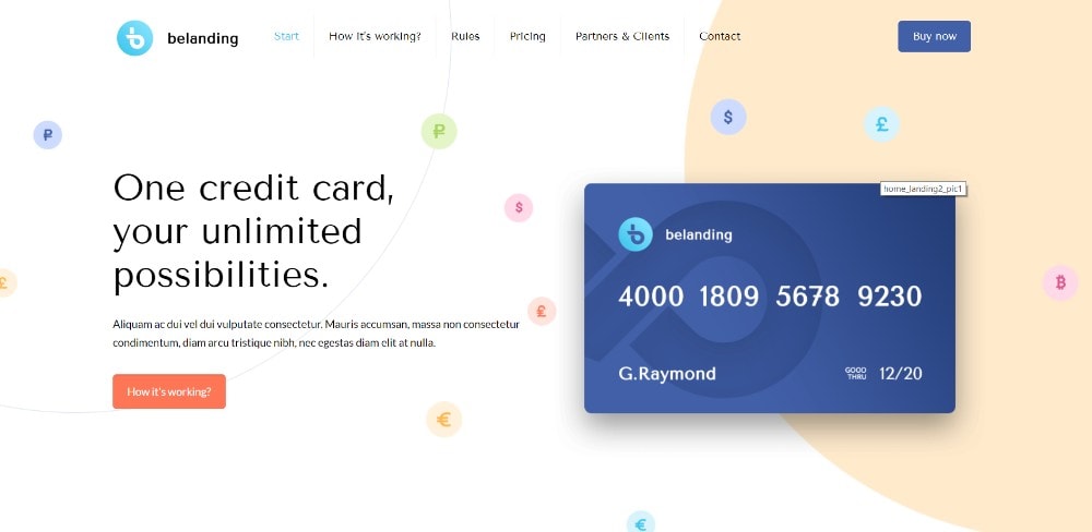
In this pre-built website, the CTA button is above the fold together with one in the menu.
Two CTA buttons placed above the fold let users choose what they want to see.
A simple opt-in form with a bold CTA button is used by this site.
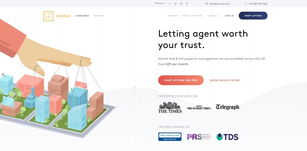
Reneza doesn’t mess around when working with CTA buttons. They use them judiciously however, and with the right choice of colors and text sizes.
Wrapping It Up
You’ve been introduced to the 5 critical one-page website elements, and how they can be used. Now, it’s simply a matter of practicing working with them until you’ve mastered the craft.
Don’t be fooled, however. These principles are reasonably simple and straightforward. Yet, it’s not always easy to apply several of them when designing a long-form one-page website. If you’re comfortable with taking a shortcut, use pre-built websites. They have these principles built in and nailed down to perfection.
A good resource is Be Theme, with a huge library of more than 60 one-pagers to choose from. It also has 400+ pre-built websites of all kinds that can be customized to fit your needs.
Like what you’re reading? Subscribe to our top stories.


