
| On: | 1 May 2019 |
| Category: | Graphics |
| Length: | 5 min read |
Data, data, everywhere. But what do you do with it? Today, we’ve collected 12 stunning examples of data visualizations in website design to jump-start your thinking about how to work with data.
We live in a time where the ability to showcase data in new and interesting ways can be a huge asset as a designer.
Whether you have a massive collection of numbers or just information that you want to showcase, this design style can be a great tool in your kit.
1. History of the NFL
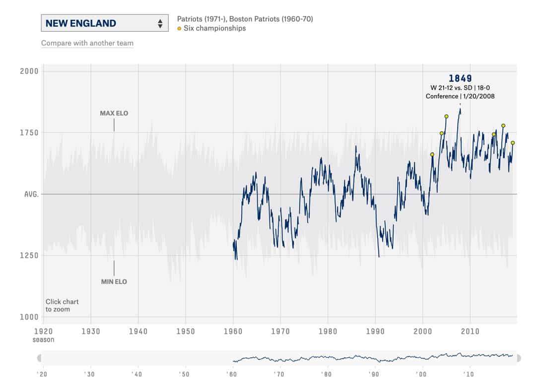
With decades of data spanning 32 teams, there’s plenty of information available about games in the NFL. FiveThirtyEight boiled it all down into a series of interactive graphs that you can view by team to see the ebbs and flows of football history.
The best thing about this data visualization is that it is super simple. The lines show wins and losses. But with clicks and hovers, the data springs to life: You can get scores, dates, and records for every single game overlaid on a map of the averages for the entire league. (So you can see if your team is ahead of or behind the pack.)
2. Selfiecity
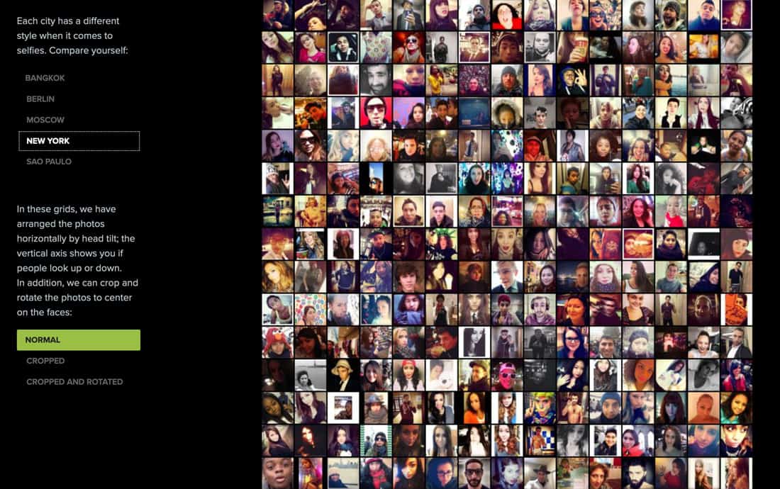
Selfies are more than just a fun set of photos. Selfiecity uses rich media visualizations to assemble thousands of photos to find demographic information about the people who take them.
What’s cool about this data set is that while it is all visual – thousands of photos – you can start to see patterns, such as the style of selfie people take in different places, whether women or men take more photos and the ages of selfie-takers. While there are some statistics and numbers here, this data is plotted using photos in a giant grid.
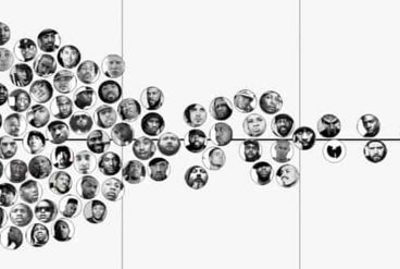
3. Largest Vocabulary in Hip Hop
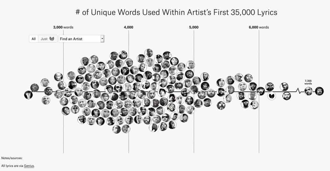
This project from ThePudding shows that data doesn’t always have to be numbered. It analyzes the number of unique words used in hip hop lyrics and plots the biggest vocabularies by the number of words with images of the artist.
Here’s how it works: “It compares the number of unique words used by some of the most famous artists in hip hop (that is, an example of a quantitive view of lyricism, once proposed by Tahir Hemphill). I used each artist’s first 35,000 lyrics. This way, prolific artists, such as Jay-Z, can be compared to newer artists, such as Drake.”
The simple black and white design of the plotted chart is visually interesting and makes it easy to see which artists are ahead of the pack. (Or you can use the more interactive tools and search for specific artists.) You can also sort by era, with the 2000s being the most lyrically robust.
4. Shopify Year in Review
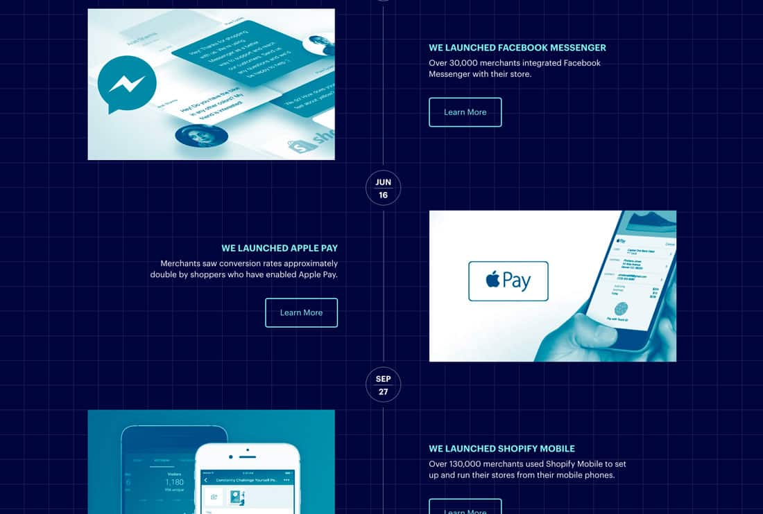
Spice up a set of annual data with a website rooted in making it all visual. Shopify’s 2016 in Review is a collection of annual report data in an easy to read package.
The site scrolls in page-like blocks with facts and information throughout. The timeline style visualization scrolls deeper into links with graphs and other numerical charts. This site shows that even with a lot of numbers, you can create something stunning and trendy.
5. Daily Routines of Famous Creative People
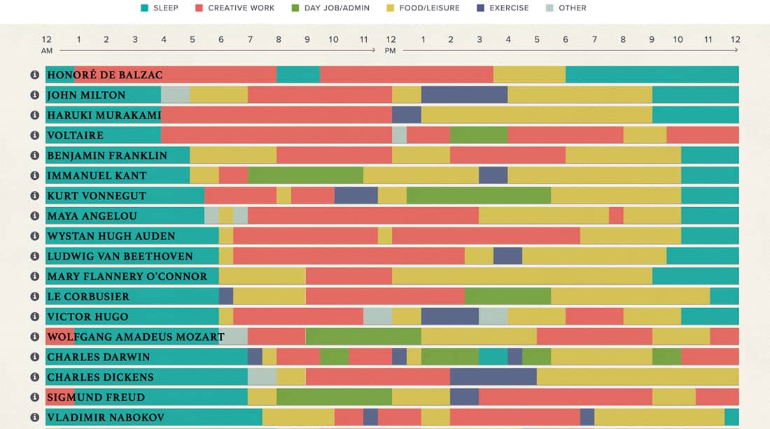
Don’t get fooled into thinking bar or line charts are boring. This amazing set of lines shows cool data that shows how some pretty famous creative spent their days. (And there’s plenty of food and leisure time in there.)
What makes this data visualization work is color. Each line means something. Each color contrasts starkly with the colors around it so that every bit of information is easy to see and understand.
6. Falling Through the Gap
This interactive data visualization from the BBC is brilliant. A set of animated dots changes on scroll action show complex information at a glance.
The animations and idea behind this interactive infographic are well planned and executed.
7. Every Total Solar Eclipse Happening
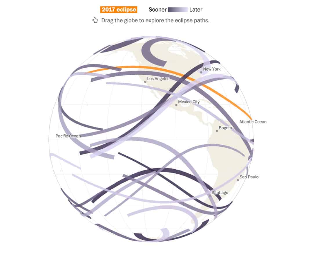
This data visualization mixes a little cool wizardry, animation, and scientific data to provide customized information about when (and if) you might see a solar eclipse.
It starts with your birth year for a custom report. Here’s mine (note the data pull is from 2017): “If you were born in 1980, you are (or will be) 37 this year. If you live to be 100, there will be 43 more total solar eclipses worldwide in your lifetime. Many will be over South America. One will only eclipse over water.”
The data expands further into explanations of how an eclipse works and paths for the 2017 event.
8. Wind Map
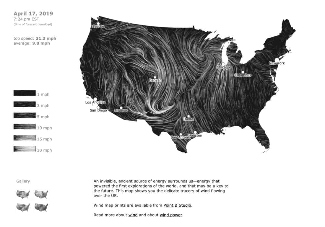
Where is the wind blowing?
This map shows wind speeds and averages for the United States in real time. Weather data is ported into a simple black and white map, that shows moving wind patterns across the nation. (I have to admit, just watching the animation is pretty addicting … and soothing.)
9. How Every Member Got to Congress
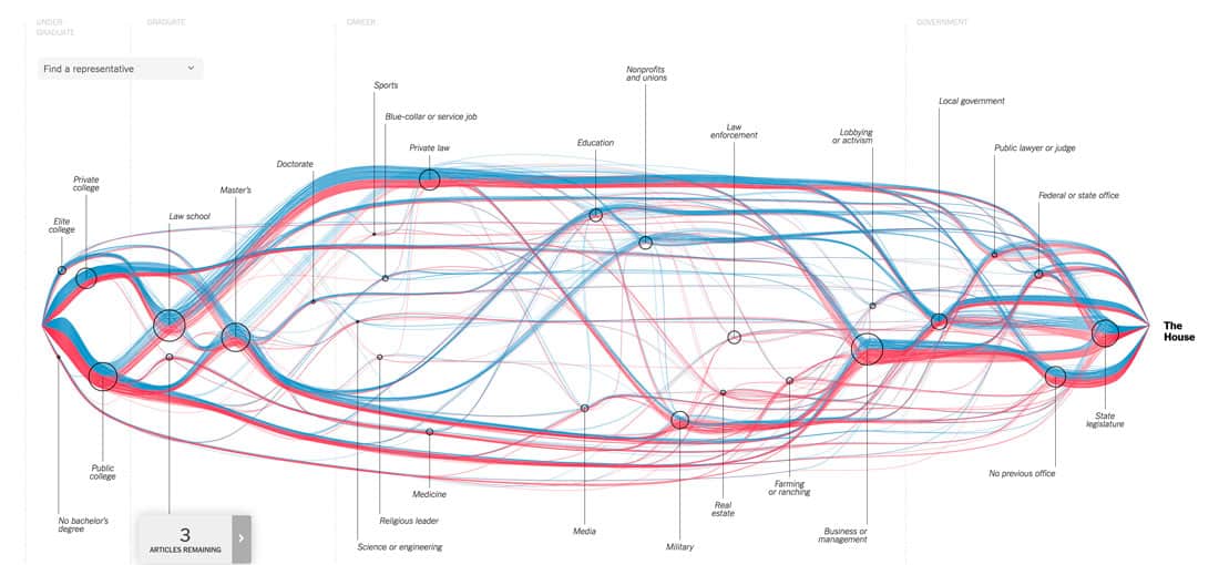
Data mapping is an exhaustive and highly informative experience. This interactive data map shows the path of each congressman and congresswoman in the U.S.
You can track education, jobs and other political experience. (It’s kind of amazing how many similar paths there are.) Dive deeper into the data by looking and individual paths of politicians.
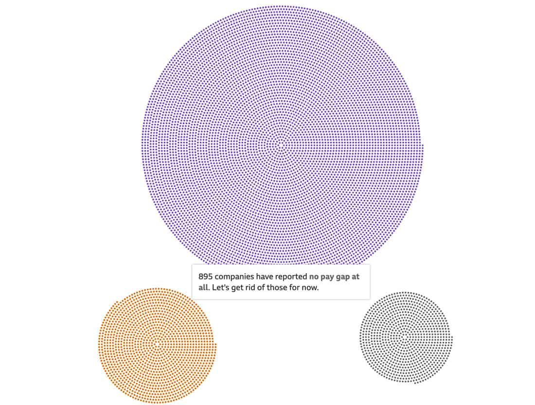
10. World’s Biggest Data Breaches and Hacks
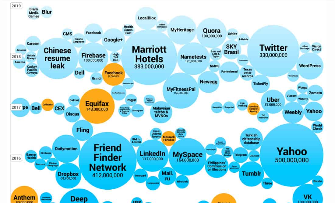
If you are looking for data that looks great, Information is Beautiful is a good place to start. This circle chart plots data breaches of 30,000 records or more from 2008 to the present.
Circle sizes represent how large of a breach occurred and it’s easy to see where your information might have gotten caught up in a data hack. Hover over any circle for more on the breach. The timeline style design also shows something else – the sheer increase in breaches annually.
11. Why Your Smartphone is Causing You ‘Text Neck’ Syndrome
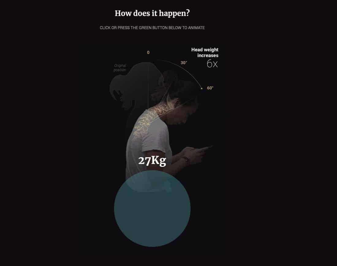
Some of the best data visualizations weave facts and a story together to provide a more complete picture of information. That’s the case with this guide to “text neck.”
Small data plots – using facts and numbers – mix with animated data that show posture changes to show (not tell) exactly what is happening in this phenomenon that started with numbers of “text neck” cases. It’s a great way to explain something visually that might not make a lot of sense otherwise.
12. Illustrated Guide to 2,339 Deaths in ‘Game of Thrones’
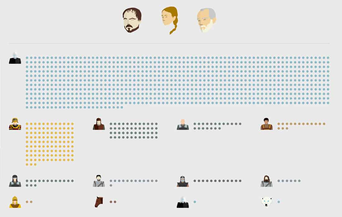
Use illustrations to make an engaging data visualization as well. The Washington Post documented every death in the popular show, “Game of Thrones,” with an illustrated guide.
Illustrations and icon coding show deaths at a glimpse with click actions that go into even more detail. Plus, everything is organized by season (and location and character type if you are interested). To prove that this is more than just fun, there’s a complete methodology to how it works and what “counts” as a death.
Conclusion
Use of data visualizations is practically everywhere. We are living in a data-driven age, where people are drawn to information and knowledge.
Being able to boil large quantities of data into a usable design is a valuable skill that can help you in a number of projects. And if you haven’t been asked to do this yet, chances are you will be soon.