When it comes to improving the metrics of a landing page campaign, there is no magical trick. There is definitely not a one-size-fits-all approach.
However, with the right UX strategy, it’s significantly easier to set up landing pages for success. Here, we’ll explore four UX concepts centered around decluttering and being direct.
Clear hero makes a great impression
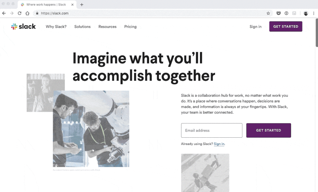
First impressions matter! Having a clutter-free header is essential. I’m not a big fan of Slack’s redesigned homepage. Why? Because a lot is going on! Full navigation, two CTA buttons, offset copy – which looks great but is hard to read. Not to mention the rotating images.
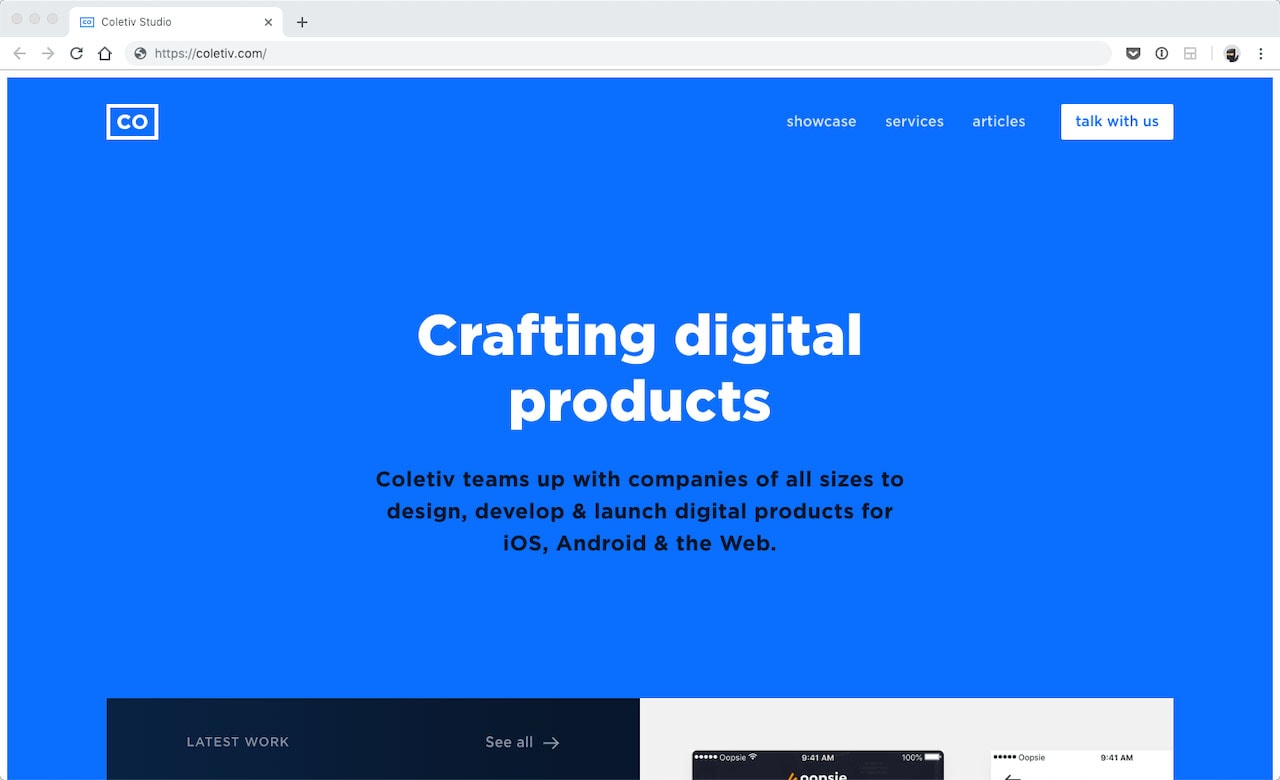
Whereas, Coletiv takes an almost opposite approach. The hero is bold thanks to color and typography choices, and the cut off images lead your eyes – and finger on the mouse – to scroll. The copy here is concise; the hero’s explicit and direct.
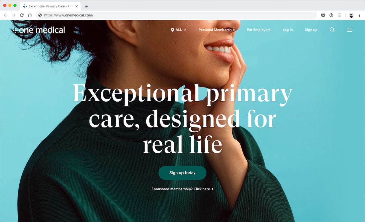
Another, almost minimal, hero is found on One Medical’s home page. It makes a statement. The overall branding is magnificent. You’re not disturbed by the navigation either.
They have a prominent CTA and a secondary one for a second target market. It’s well executed.
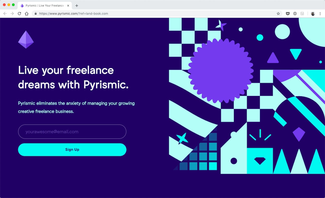
Last, let’s have a look at Pyrismic. The copy and the CTA are kept in one place all the way to the left. Short, sweet and to the point. The graphics don’t get in the way of a visitor’s readability, which makes it easier for a new visitor to understand what Pyrismic has to offer.
Short copy gets to the point
Most people aren’t excited about reading paragraphs upon paragraphs online. This is important for two reasons. Often, people leave after only 15 seconds of being on a webpage. This means the design needs to make the point promptly! Otherwise the lead is lost. Conversion rates stay low but the bounce rate stays high.
Online HTML Email Template Builder
With Postcards you can create and edit email templates online without any coding skills! Includes more than 100 components to help you create custom emails templates faster than ever before. Try now for free!
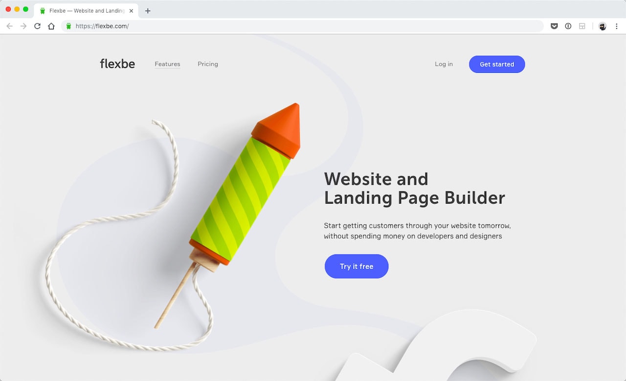
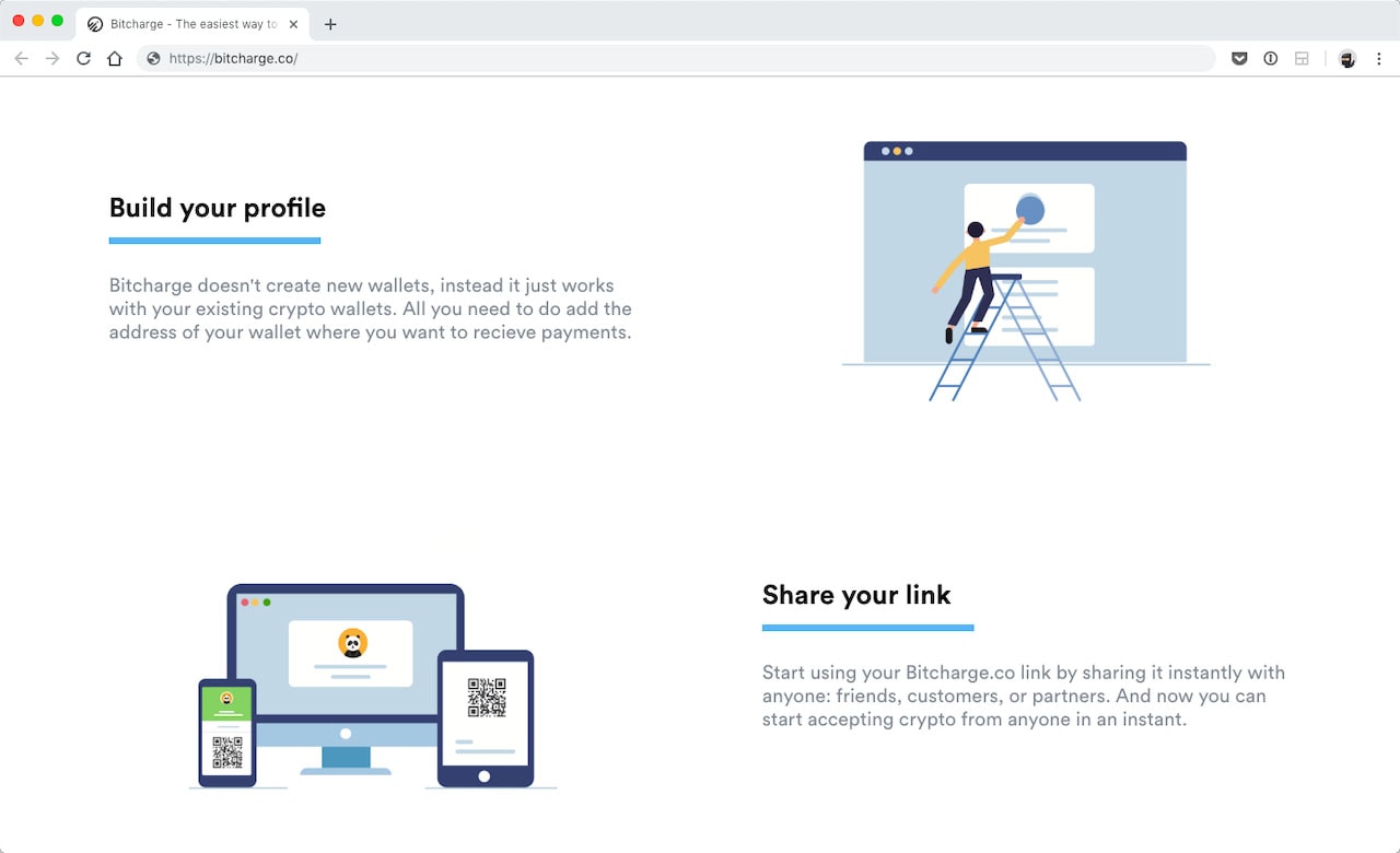
Every section of Flexbe’s landing page has two components. A large image and a short bit of copy. There is very little clutter around the CTAs. (More on CTAs in the next section.) The same is true of the landing page for Bitcharge.
Although the supporting copy seems a little lengthy, all in all, the headers are short. Below the hero, each headers is made up of three short words. Talk about concise.
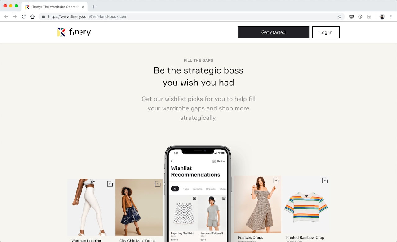
The same is true on Finery’s landing page. The typography is larger, thin and spacious. It’s easy to read, to say the least. Here the design lets images of their app do a lot of the “talking,” which requires very little copy.
You don’t get what you don’t ask for
Having a clear ask through a CTA is paramount. If you’re not asking correctly, it’s a lost lead. To get the best results on conversion rates (and other metrics), a CTA must show up at the right place with the right ask.
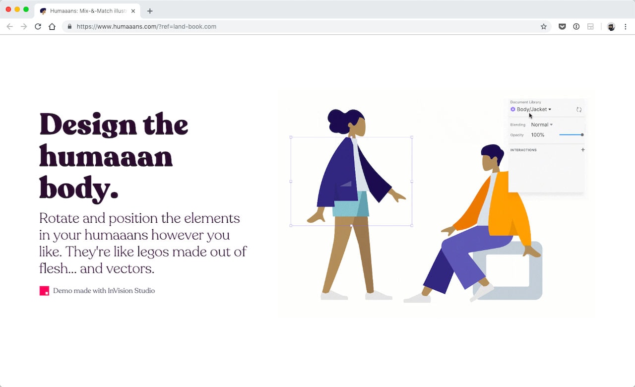
It’s a real shame the landing page for humaaans doesn’t have more CTAs. There are only two on the whole page. They have a total of seven sections, two of which have a big CTA button. The third section – “Design the humaaan body” – has a small text link for a demo, which is not clearly visible. There is a missed opportunity as well in the remaining sections. The sections which explain the benefits of using their library could benefit from a CTA.
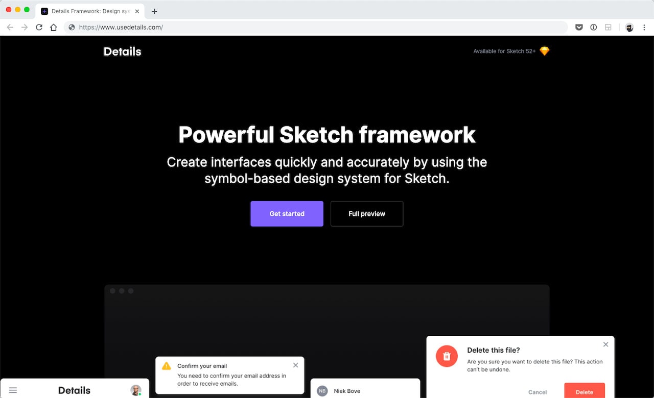
Details, a Sketch framework does a great job of using diverse CTAs depending on the context surrounding button placement. In the hero, they have two CTAs – to get started and to do a full preview. Further down, they have a CTA for people who love using Sketch Cloud – “Preview on Sketch Cloud.” Last, in the footer, they’re asking for a buy and have a second CTA for people who are not interested yet.
Someone is more likely to convert once they’ve tried out the framework, which makes sense for them to put a secondary CTA to download a demo. It catches both audiences.
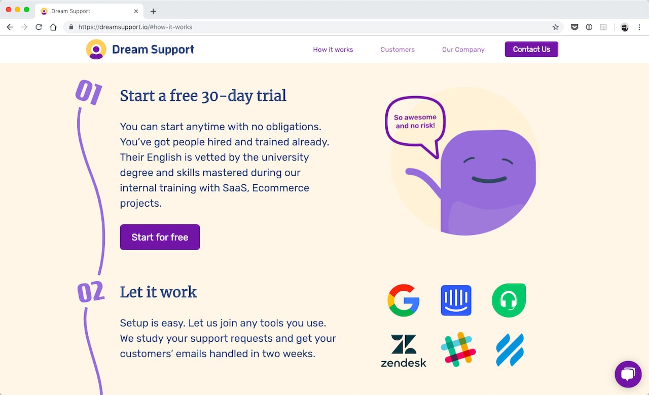
Dream Support, a customer service app, has a “contact us” CTA in the fixed navigation. It’s always present; as well in the hero.
They have another CTA midway down that entices visitors to try them for free. At the bottom of the landing page is a final CTA “Let’s Get Started.” That makes sense because at this point someone has scrolled all the way down and just might have been won over.
CTAs are essential no matter what shape or format they take – as long as they are visible, of course – because it guides a visitor to take action. Without well thought out CTAs that ask for a sale or other conversion, it’s a dead end for visitors.
Clear the path to purchase
Unbouce defines a landing page as “a standalone webpage, created specifically for the purposes of a marketing or advertising campaign.” Meaning it has a singular purpose such as selling a single product, webinar or service. This also means that the path to conversion cannot be obscured by other things, especially additional promotions.
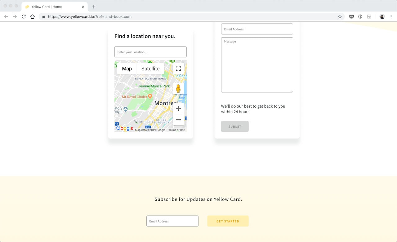
Let’s talk about the homepage of Yellow Card. It’s a relevant example because they’re selling a single product. Yet they have two completely different CTAs. One for subscribing — it is unclear what that means in terms of a cryptocurrency card — and one to find a store near you. At the bottom of the page, there are three different CTAs — one to find the nearest store, right next to a contact form and subscription option.
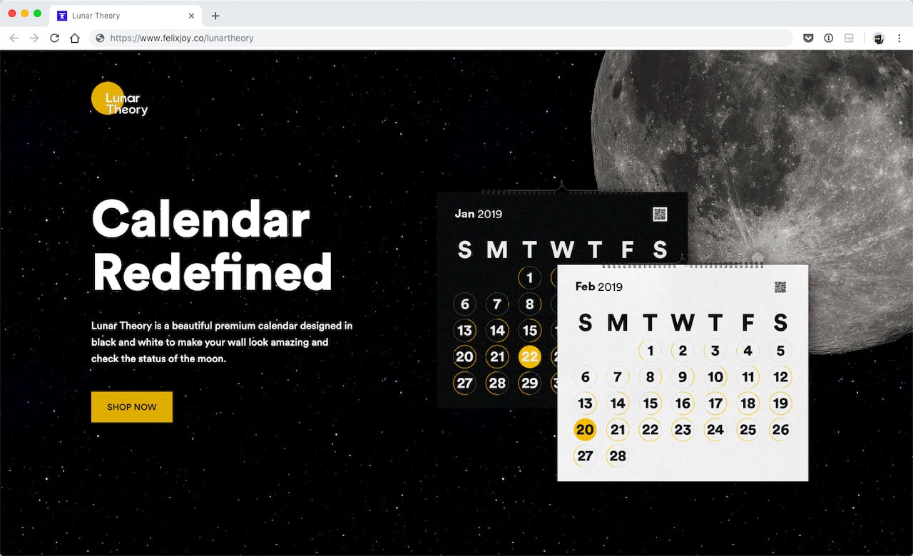
Let’s take a look at some landing pages doing it right. Lunar Theory sells printed lunar calendars; there are no links on the page except some shop now CTAs. The landing page is short and to the point. It shows pictures of the calendar on walls. The one and only purpose of this landing page is to get people to buy the calendar. It’s direct. It’s distraction-free. They’re not asking anyone to sign up for email updates or to check out a blog.
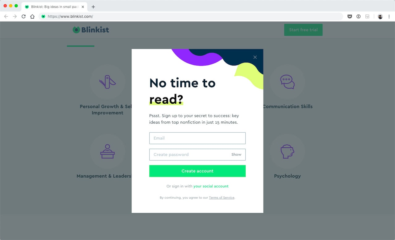
The same is true of Blinkist’s landing page. It’s all about starting a free trial. What I love the most about this example is that they have a popup that stays true to the campaign. It asks visitors to enter an email address to create an account to, you guessed it, start a free trial. The focus is clear, and so is the path to converting visitors.
The takeaway
There are many different strategies one could use to improve conversion rates and metrics on their landing pages. Making a clear and distraction free offer is a fantastic first step. It helps to remove clutter that could get in the way of converting a lead, which helps make the most of your incoming traffic.
Like what you’re reading? Subscribe to our top stories.

