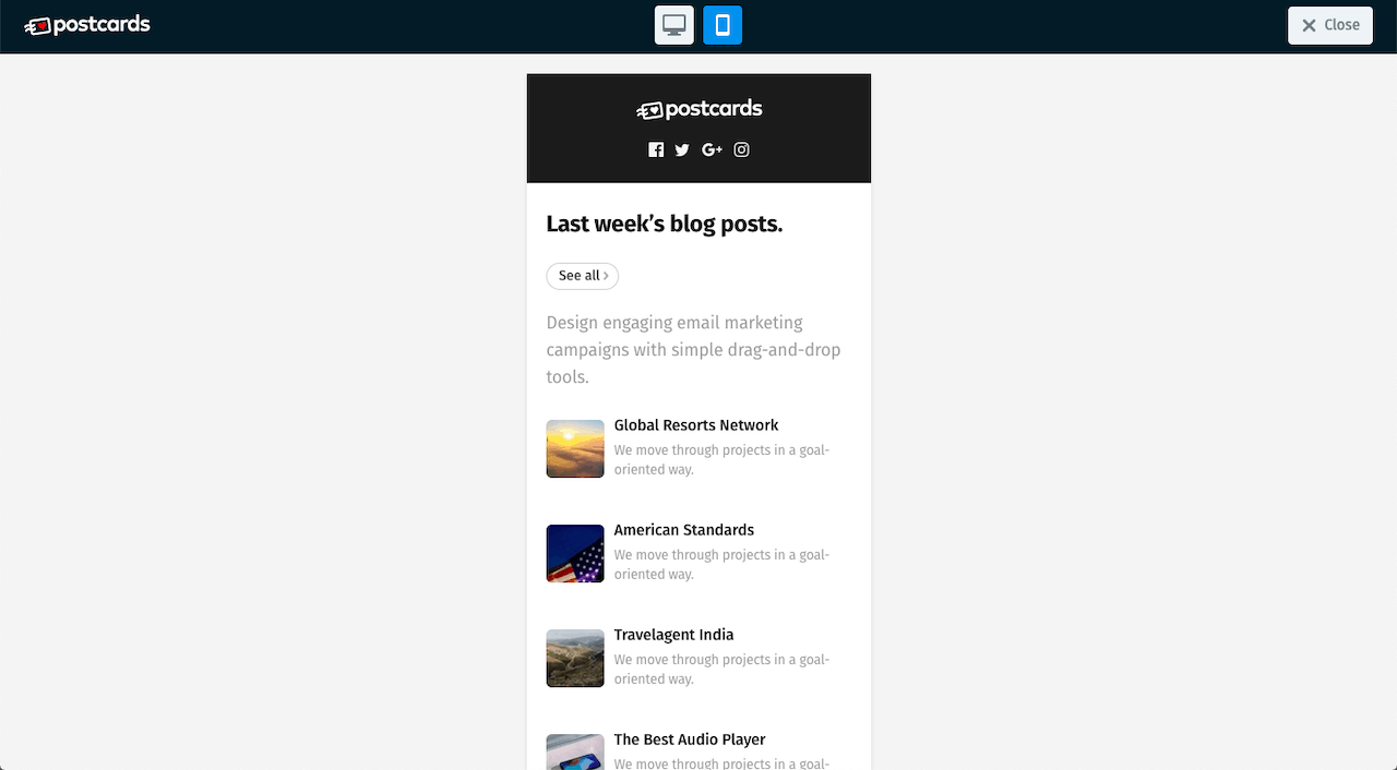
When it comes to email marketing, there are a few things that make a big difference. Email marketing can be an indispensable investment.
However, that’s only when emails are well-designed, and campaigns are well thought out.
Let’s see exactly what will help you make the most of the next email campaign you’ll be working on.
1. Readability and Scalability
It’s no secret that attention spans are short, especially when it comes to the digital world. That’s why the best emails are easy to digest and easy to read. Visual design factors can help or hinder the reading experience and influence the success of a campaign.
Contrast between text and the background, the size of the fonts and even the messiness of the overall design are important considerations.
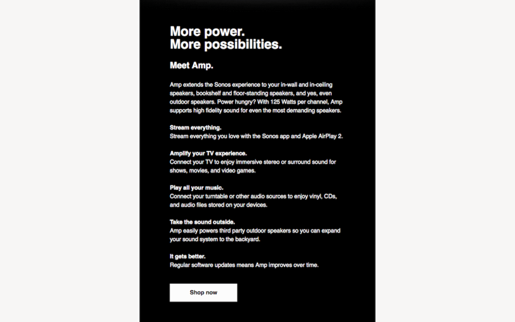
Below is an example from Sonos. Although the visual design isn’t too bad, readability is a different story. There’s a lack of differentiation between the smaller headings and the body copy. It’s hard to distinguish one from the other so the text appears similar and becomes overwhelming. This situation discourages reading and makes scanning this email more difficult than it needs to be.
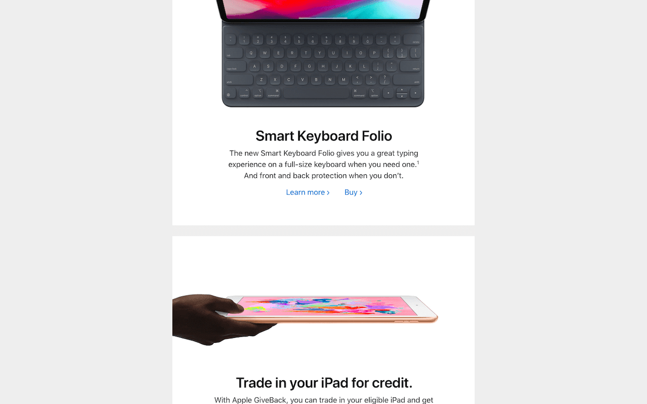
On the other hand, is one of Apple’s emails. It has a good flow, larger text and easily distinguishable copy between links, headings and the body. This email uses large images to divide sections. The copy is concise. Yes, this is a long email, but because it’s been designed for readability, the length doesn’t pose a problem. The overall design makes it comfortable to scan and to read.
2. Stick to the Promise
Are emails fulfilling their purpose and promise? There are multiple ways this can be done wrong. If I sign up for a newsletter or a free download and get a bunch of uncalled for promotions, a promise is broken. There is nothing wrong with upselling or promoting, but overdoing is distasteful and can hurt conversion rates.
Online HTML Email Template Builder
With Postcards you can create and edit email templates online without any coding skills! Includes more than 100 components to help you create custom emails templates faster than ever before. Try now for free!
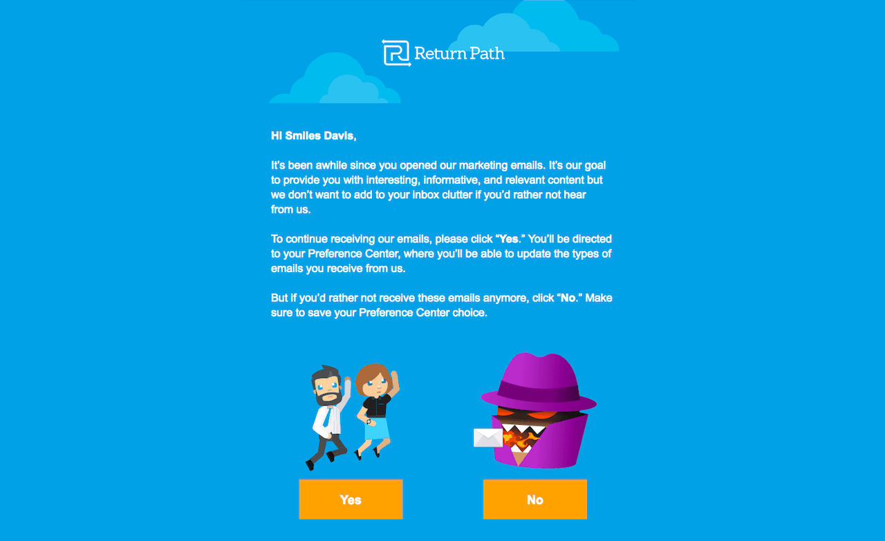
Below is a follow-up email from Return Path. As the context suggests, it’s sent to a subscriber who hasn’t been opening emails for a while. Either the subscriber wants to keep getting emails or not, as indicated by giant buttons. There is a small pitch at the bottom, but it doesn’t take away from the purpose of the email.
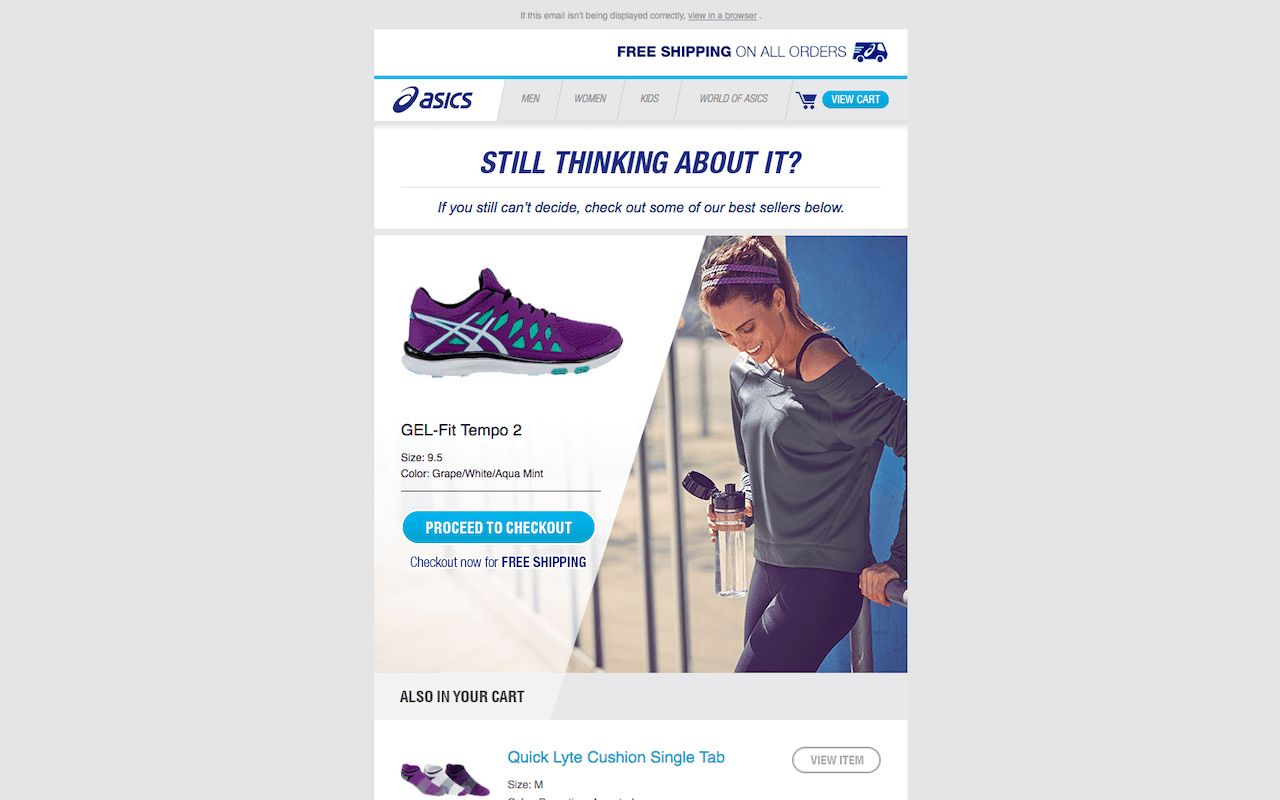
Next, we have an abandoned cart follow up email from ASICS. This email is all over the place; it’s messy and unfocused. There is small, website-like navigation at the top, a picture of a random woman next to a singled out cart item, and then remaining cart items with awkward context, two separate CTAs to either shop more or check out and additional suggested items. There are too many distractions. The action for the user is not obvious here.
3. Use Subjects and Previews Wisely
Make sure you customize email subject and preview lines! This is important. I made a mistake when I first set up my newsletter where the email subject was the name of my website, not the title of the blog post (1).

Then I tried to put the description of the blog post as the preview text. That didn’t work too well for me either (2). Next, I figured out how to get the email’s subject to be the title of the blog post but still messed up the preview line (3). As you can see, none of these examples are great.

It’s best when the subject and preview text are different because those little bits of information give a lot of insight. They help get a subscriber interested enough to open an email. If it’s messed up like my failed examples, your open email rates will suffer.
4. Personalization and Sequencing
Personalize the email experience. It’s things like using a person’s name here and there. But, take it a step further. If you think of it from a UX point of view, it makes more sense to create email sequences/drips within campaigns. That’s because these acknowledge what subscribers already know.
Use sequencing and drip emails to send targeted and specialized emails that speak more accurately to the subscriber. Knowing if someone has bought your stuff before or downloaded freebies (and what they were) deserves an entirely different email than someone who has just subscribed versus someone who has been a subscriber for a long time but hasn’t taken any action.
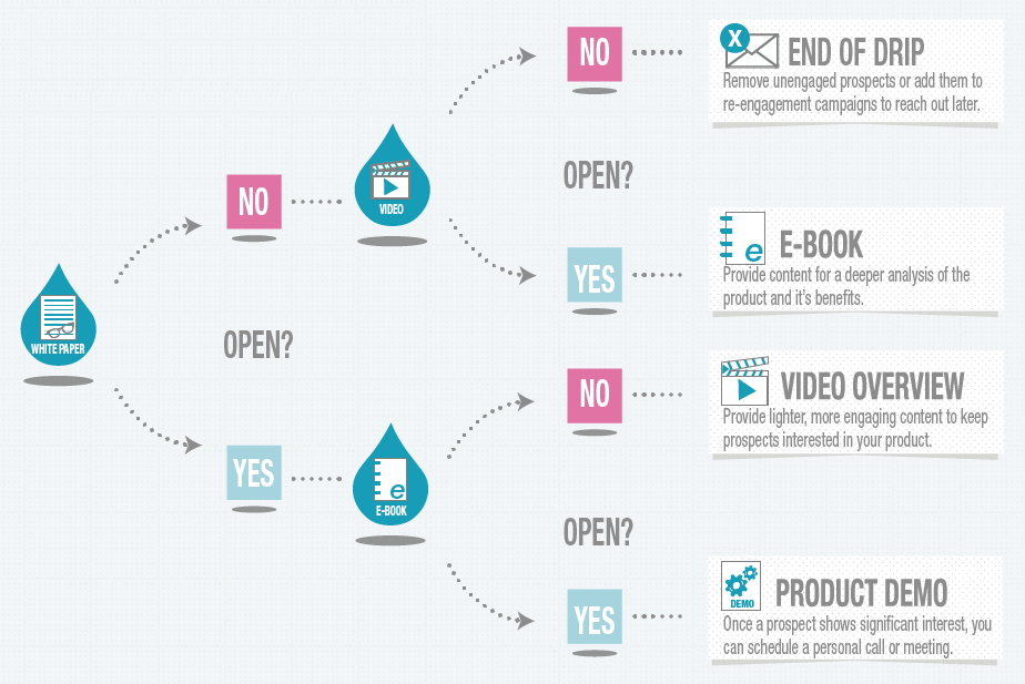
Create a flow chart of all the emails and their corresponding sequences. This will make campaigns more effective. The beauty of email marketing is that automation makes it easy to reuse sequences or drips. It’s an investment in time and effort, but it will pay off in significantly higher conversion rates and metrics.
5. Get in Touch
When it comes to emails, I’ve noticed how rare it is for me to easily reply to the sender. It’s something individuals and companies of all sizes lack. The worst thing I see is emails that start with “noreply@….” I’m baffled by this. It’s rude. It’s a missed opportunity from a business standpoint.
I love Mel Robbins to death, and I can empathize with the fact she has a tiny team while her most recent campaign, The Mindset Reset, received hundreds of thousands of subscribers. But having the first link in the email’s footer to go to the FAQ is a bit impersonal.

For as long as I remember, Paul Jarvis has replied to newsletter emails. Depending on the email, he outright asked subscribers to reply directly. He’s a king when it comes to successful email marketing campaigns; it’s at the core of his business.
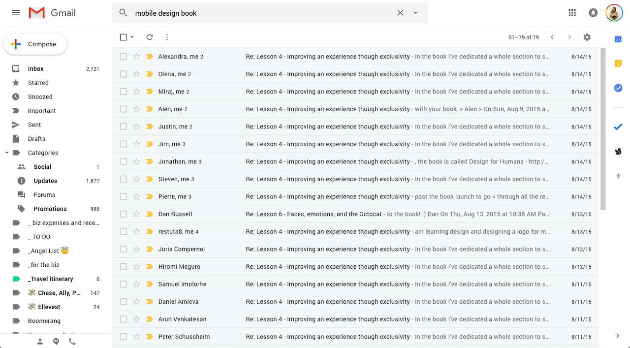
When I ran an email marketing campaign for Mobile Design Book, we asked our subscribers to reply with feedback or to specific questions. And they did, very often too – that’s what the above screenshot shows. This helped us drive higher engagement throughout the campaign and, in the end, increased sales.
6. Mobile Optimization
It’s crucial to have a flexible email template that works on desktop apps as well as mobile ones. Default templates from most email marketing services, such as MailChimp, Omnisend or ConvertKit, are mobile-friendly. However, if you’re designing a custom one, make sure it’s responsive. Test the design to make sure it works in apps from Gmail to Outlook. Test the design on different devices as well.
Save some time by using analytics tools to see precise device and platform break downs for subscribers. This way, you don’t have to test every possible option.
Custom Designs Made Easier
If you tend to design custom emails often, use a tool like Postcards. It’s a simple drag and drop builder that’s highly customizable for branding and functionality. Postcards design components are optimized for desktop and mobile emails automatically.
I recommend checking out a couple of tutorials here on Designmodo. One is for coding a custom and responsive email template with HTML and CSS. The other is on creating a custom responsive email template using Postcards.
7. Testing, Testing, Testing
The last piece of advice I have is to test your emails. No matter what. Everybody and their mother, myself included, have a handful of email marketing strategies that work. These tips and tricks are great best practice principles. What will get the best results for your emails and campaigns can only be determined through testing different strategies.
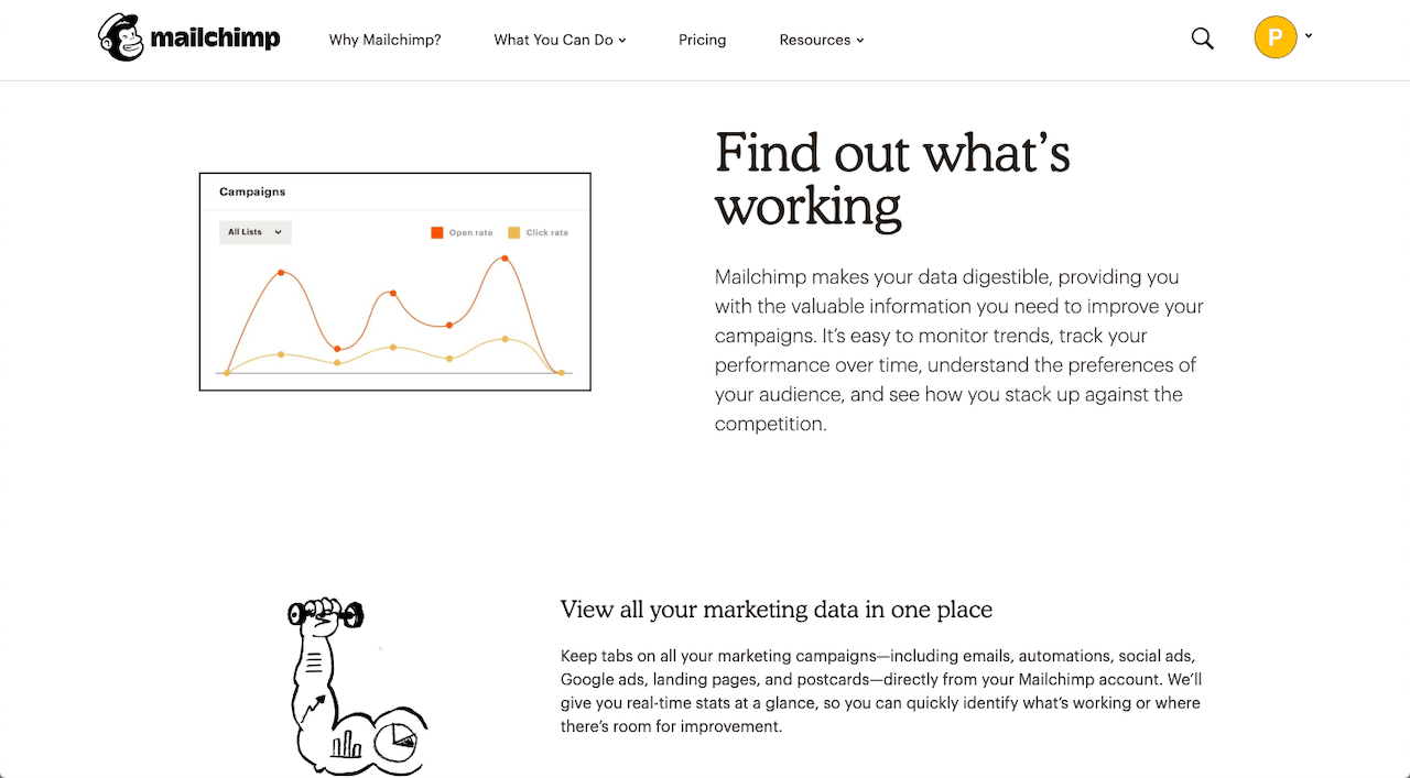
Testing ideas are easy and accessible through just about all major email marketing services including Postcards, MailChimp or ConvertKit.
Conclusion
Email marketing is growing in popularity. After all, it’s an effective marketing tool. The seven principles outlined in this post will help you make sure you start on the right foot when it comes to designing an email or email marketing campaign.
Like what you’re reading? Subscribe to our top stories.


