After it was announced that Google is pushing a new redesign, we should definitely take a look to see the differences between Gmail 8 version and the new one (Gmail version 9.x).
The important thing is that both Android and iOS versions contain the same characteristics. So, now is the time to explore these updates!
New design – white with rounded corners
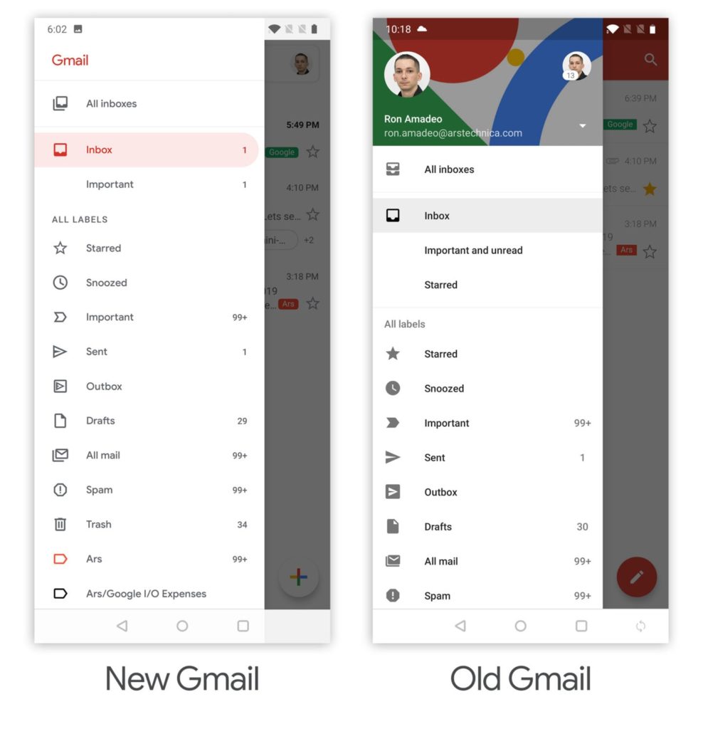
The app version matches a desktop version of the Gmail that was released in April. Furthermore, the predominant color is white and horizontal line dividers are a thing from the past, which means the only thing that separates your messages is – white space.
Also, they have used round corners for everything. Messages are still in Roboto font while all the other things are typed in Product Sans, which is the same typeface as Google’s logo.
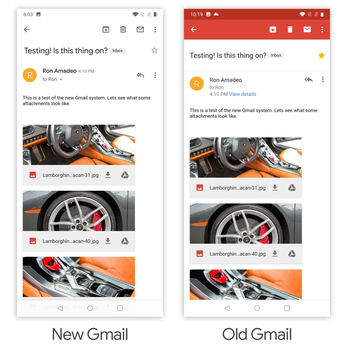
When you enter your Gmail, you will still have to deal with the red header at the top. However, when you click on the action bar, you will see that Google has used the white design for this particular feature.
Account switcher and inbox density
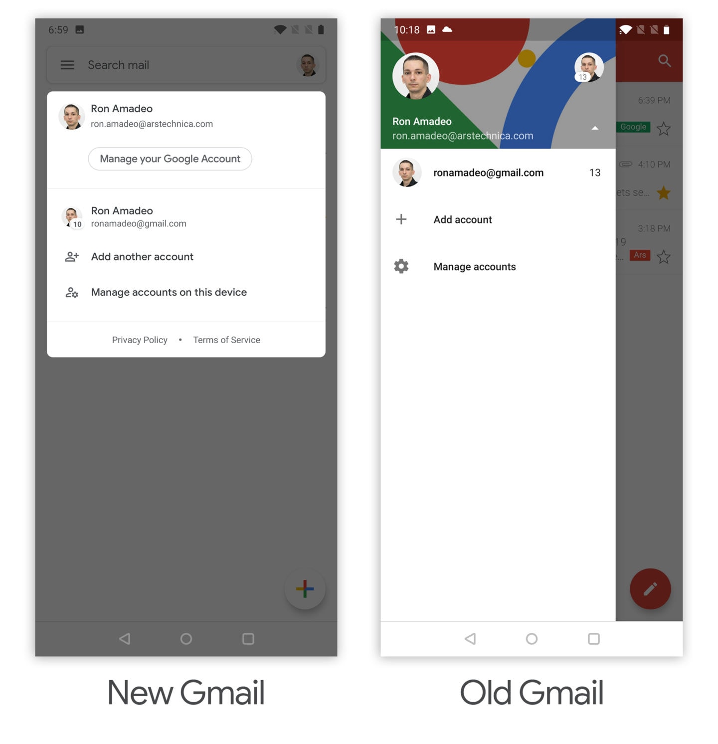
The header is enriched with a new account switcher, which is placed on the right side of the search bar as your profile picture. When you tap on it, you will get the opportunity to switch the account as the window with other accounts pops up immediately. Also, it is easier to tell which account you are using at the moment, as you can see your profile picture from the inbox view, and that was not possible in the previous versions.
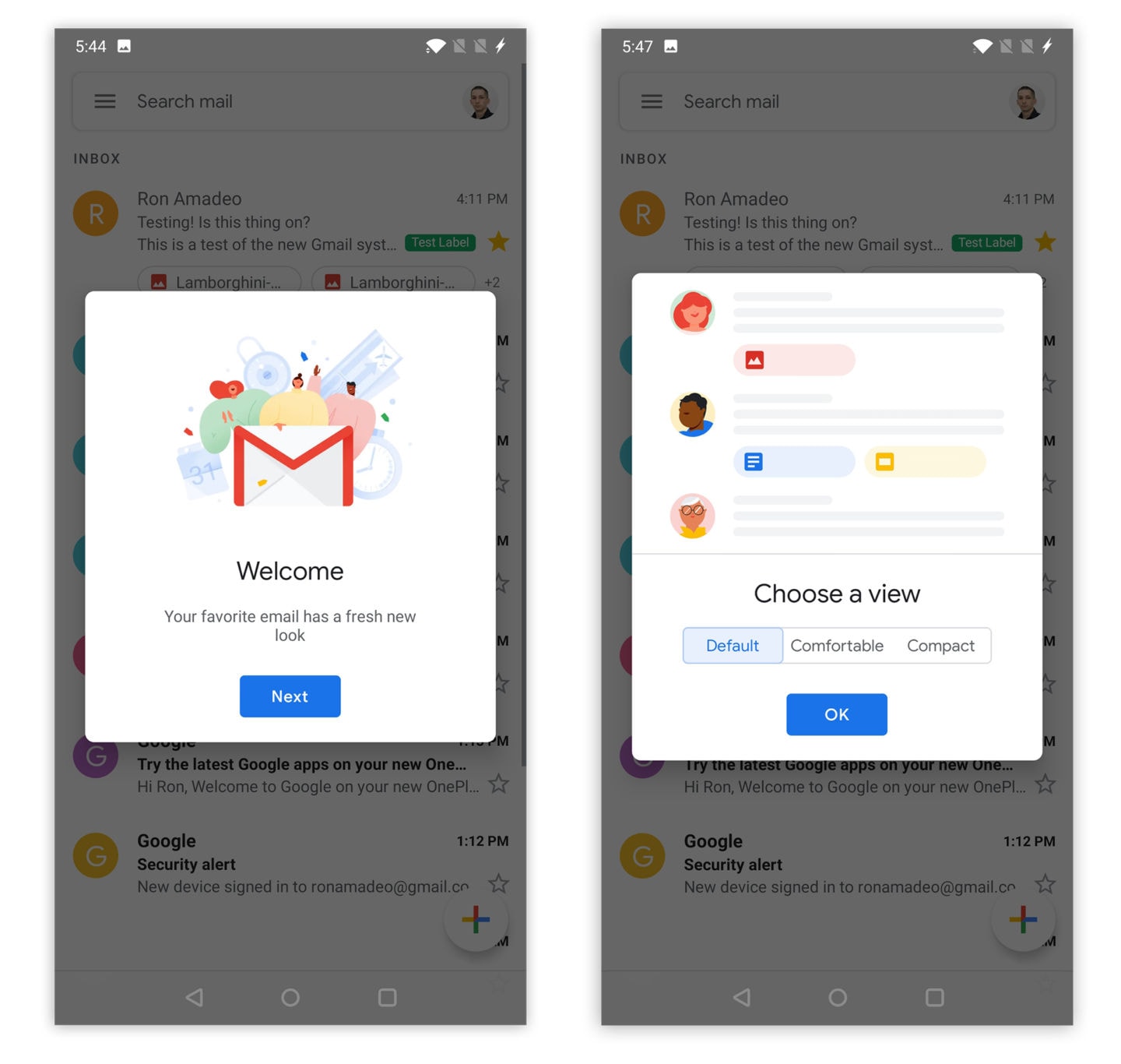
If you open your Gmail for the first time in this new version, you will get to choose some new things. After the welcome message, you will get to choose inbox density. So, you can switch between “Default,” “Comfortable,” and “Compact” display modes for your inbox messages.
The “Default” one is the biggest and shows contact icons, a line of preview text, and a row for the new attachment buttons. “Comfortable” erases the attachment row, and “Compact” removes the preview text line and contact pictures.
Online HTML Email Template Builder
With Postcards you can create and edit email templates online without any coding skills! Includes more than 100 components to help you create custom emails templates faster than ever before. Try now for free!
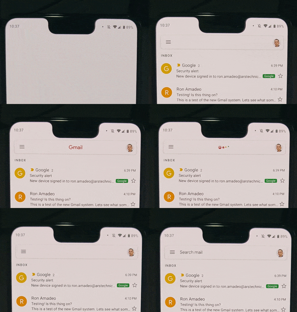
Gmail Logo Animation
Is it a big redesign after all?
Well, inbox density and a new layer of the white paint are practically the biggest changes there are. All the controls are in the same place they were, and there are no improvements when it comes to dark mode.
To summarize: we expect to see dark mode and control improvements in the next version.
Like what you’re reading? Subscribe to our top stories.

